Trajektory Dashboard Design in Tableu w. Branding guidelines, Material Design & Data Visualization
Oct 2020
Role: Digital Product Designer
Team: Marketing
Reported to: CEO, VP of Marketing
Client: Trajektory, B2B Data Sports Company based in Chicago, IL, USA.
What is Trajektory?
Trajektory is an innovative data insights and valuation technology start-up with a unique take on how to leverage and value data throughout sports assets.
General Problems of old design:
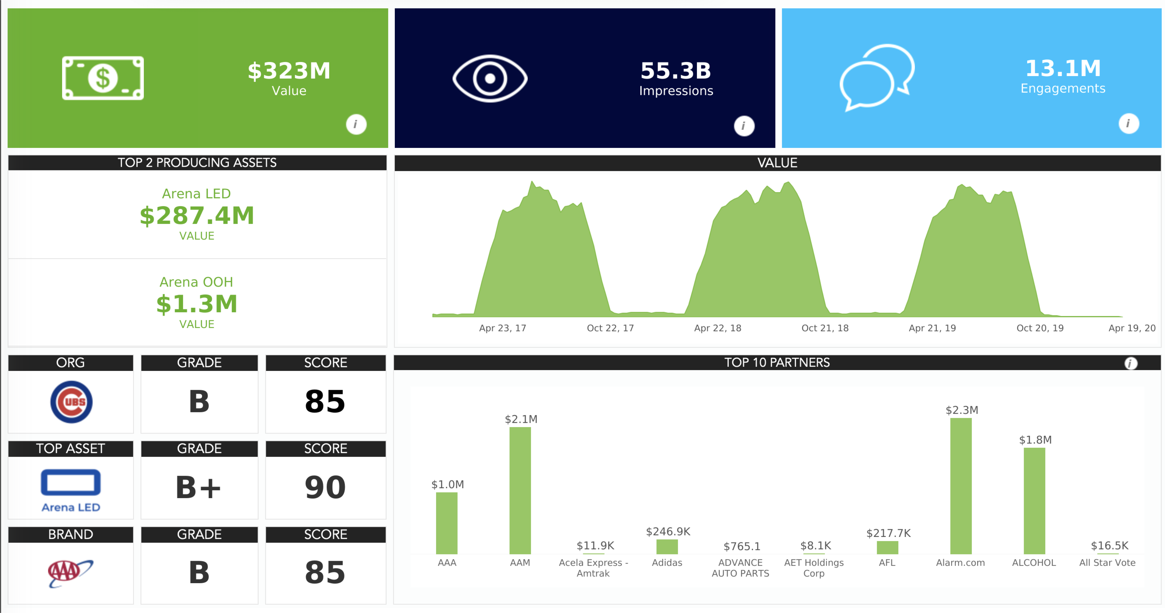
- Too many KPIs in several pages at once
- Lack of description of what the single sections are
- Lack of design consistency across different dashboards
Things they got right:
- Use of colors (the diagrams referred to a specific asset and the asset have the same color palette)
Things to do:
- Change structure (overall)
- See which data viz diagrams can change (individual)
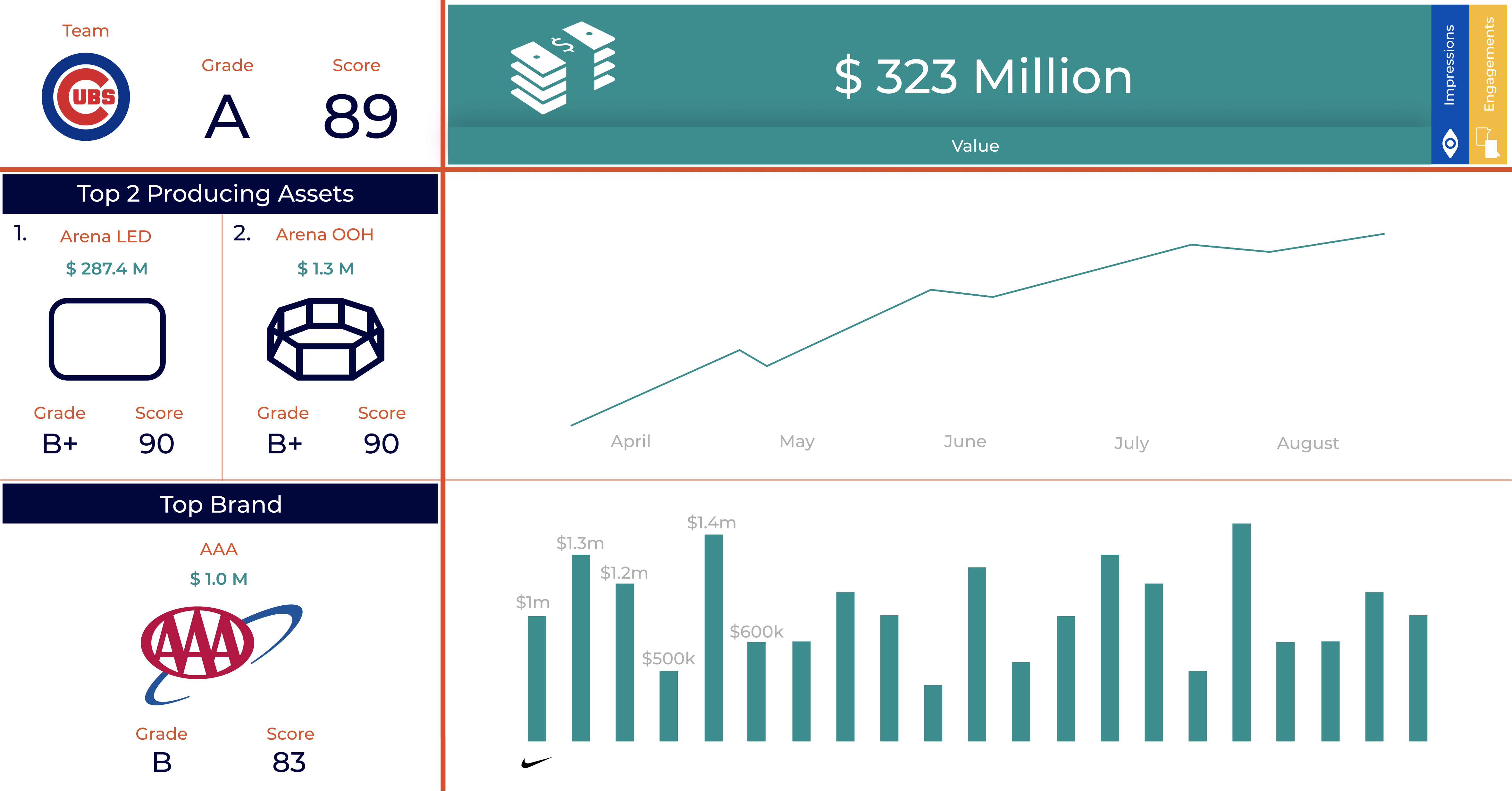
- Apply new visual design guidelines to it and create a new brand guideline document
Old Design - Insights Dashboard



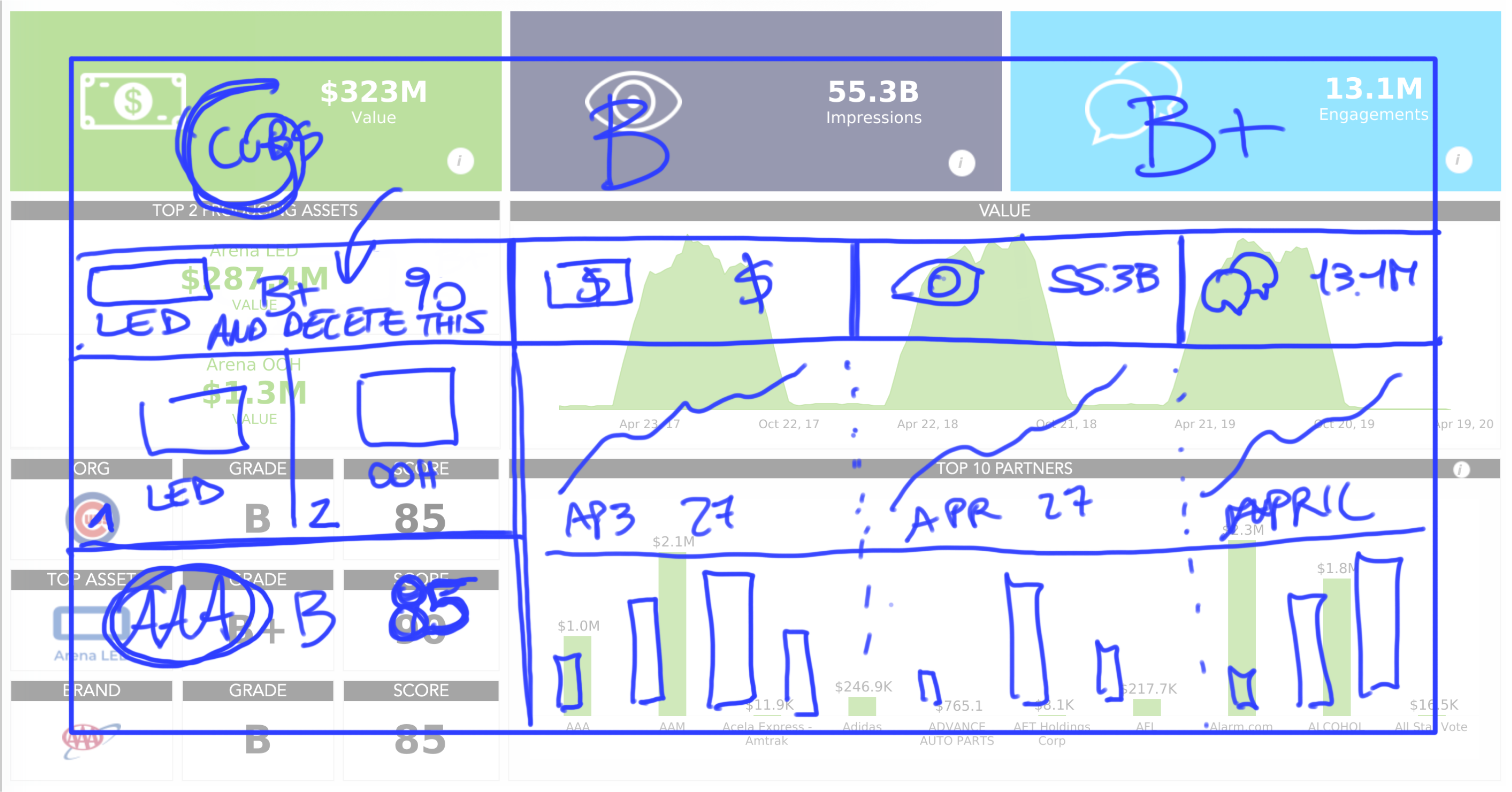

New Design - Insights Dashboard version(s)


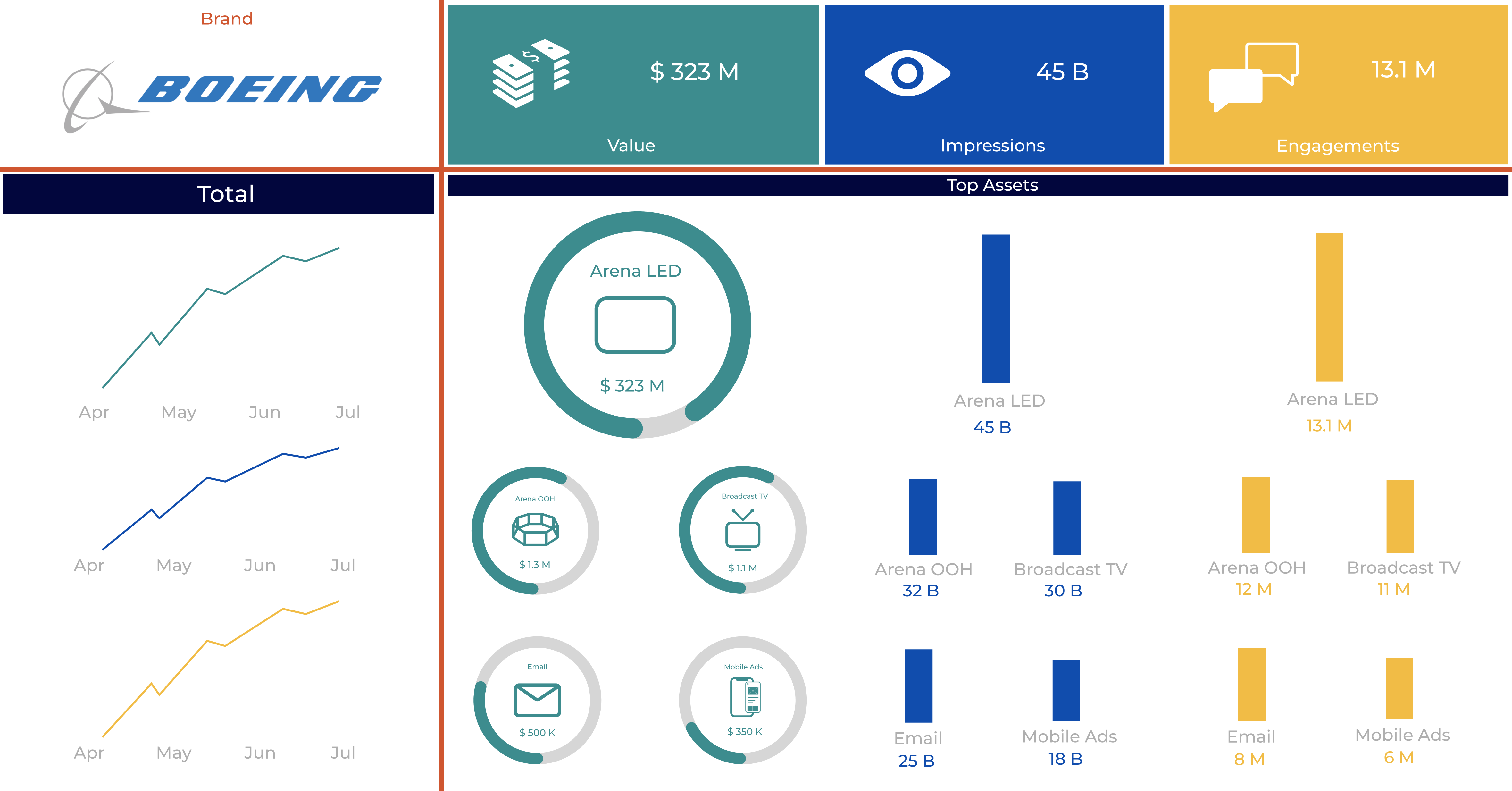
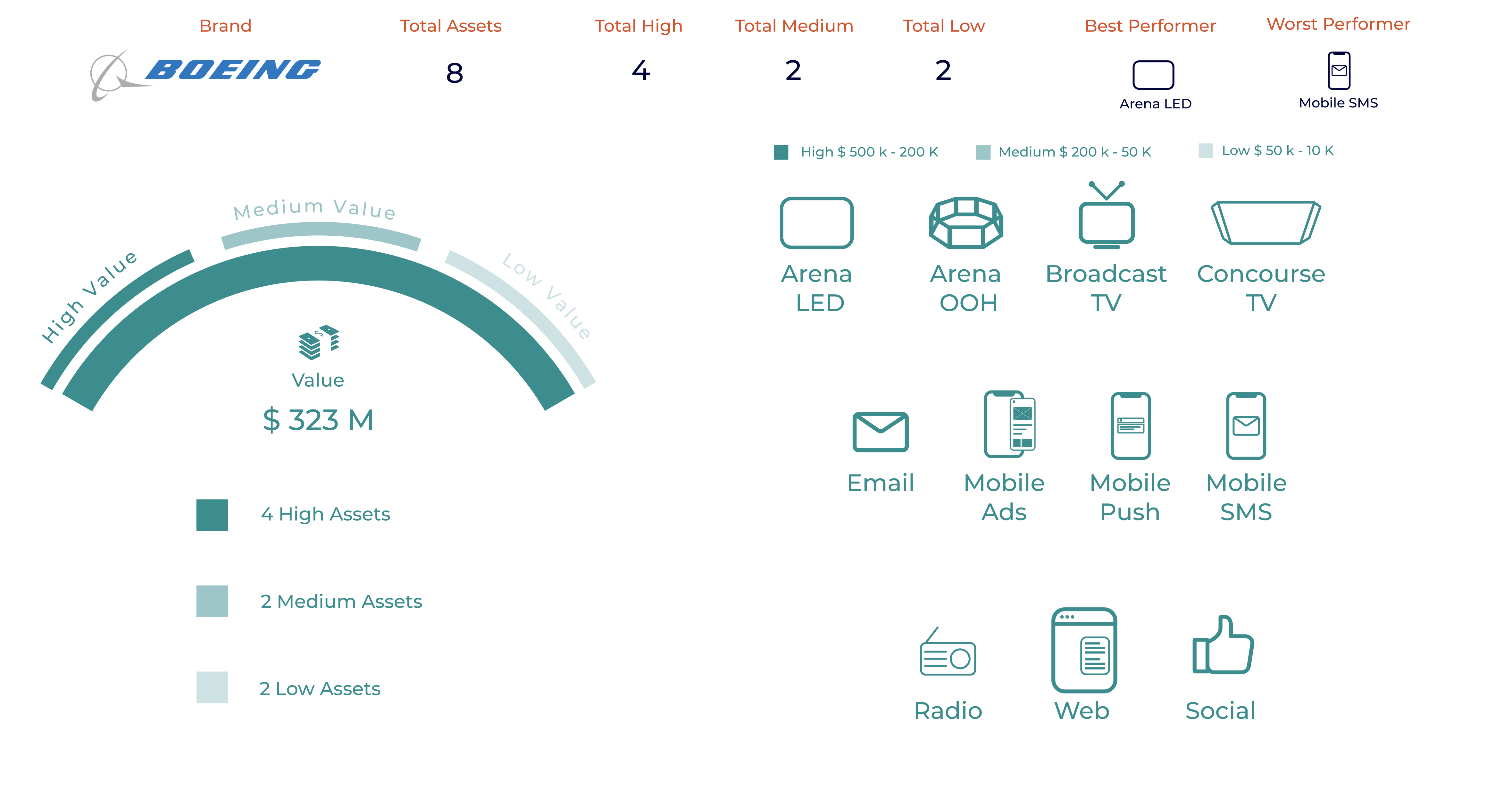
Old Design - Brand Asset Dashboard
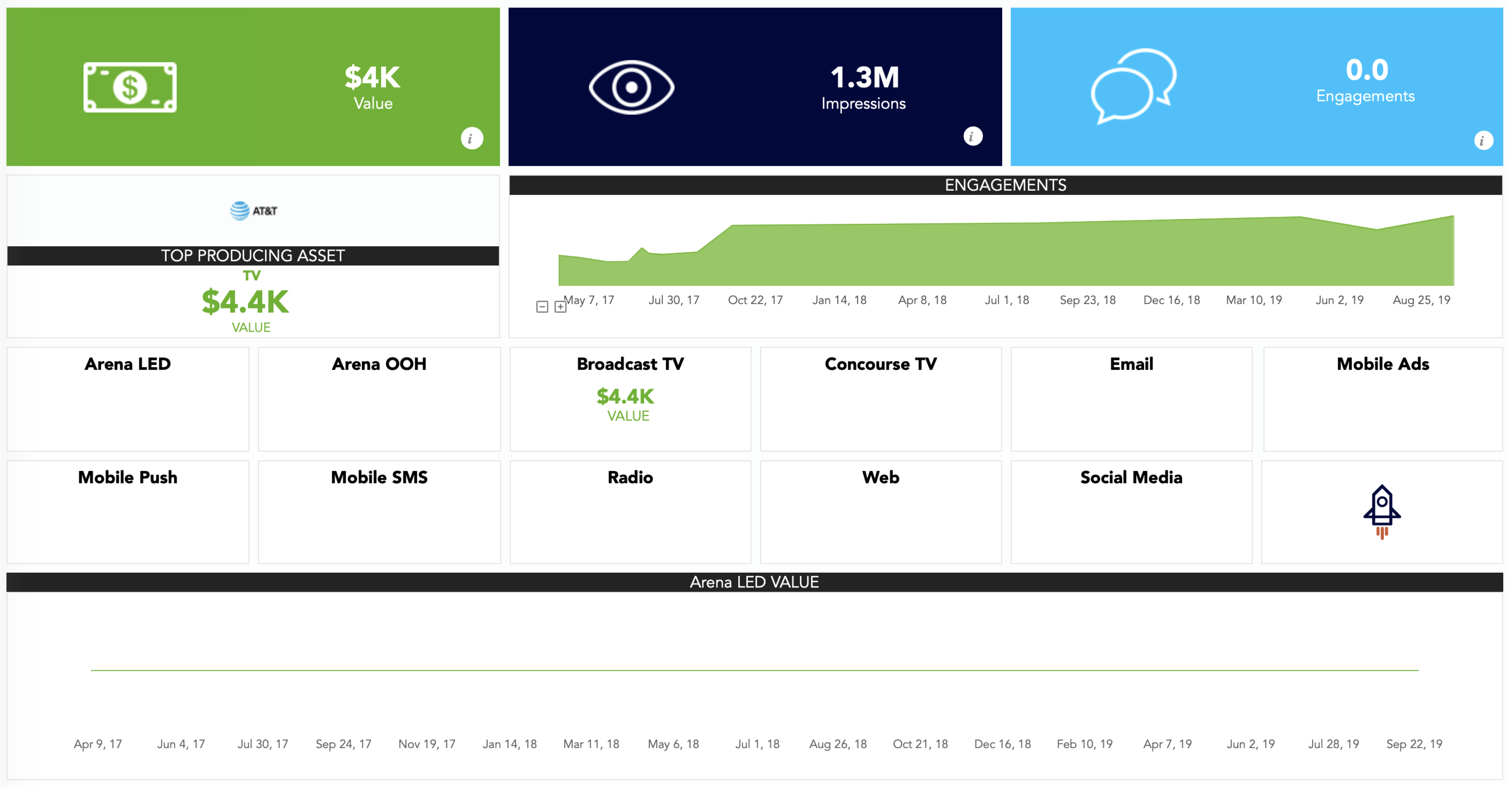


New Design - Brand Asset Dashboard

Old Design - Social Media Dashboard

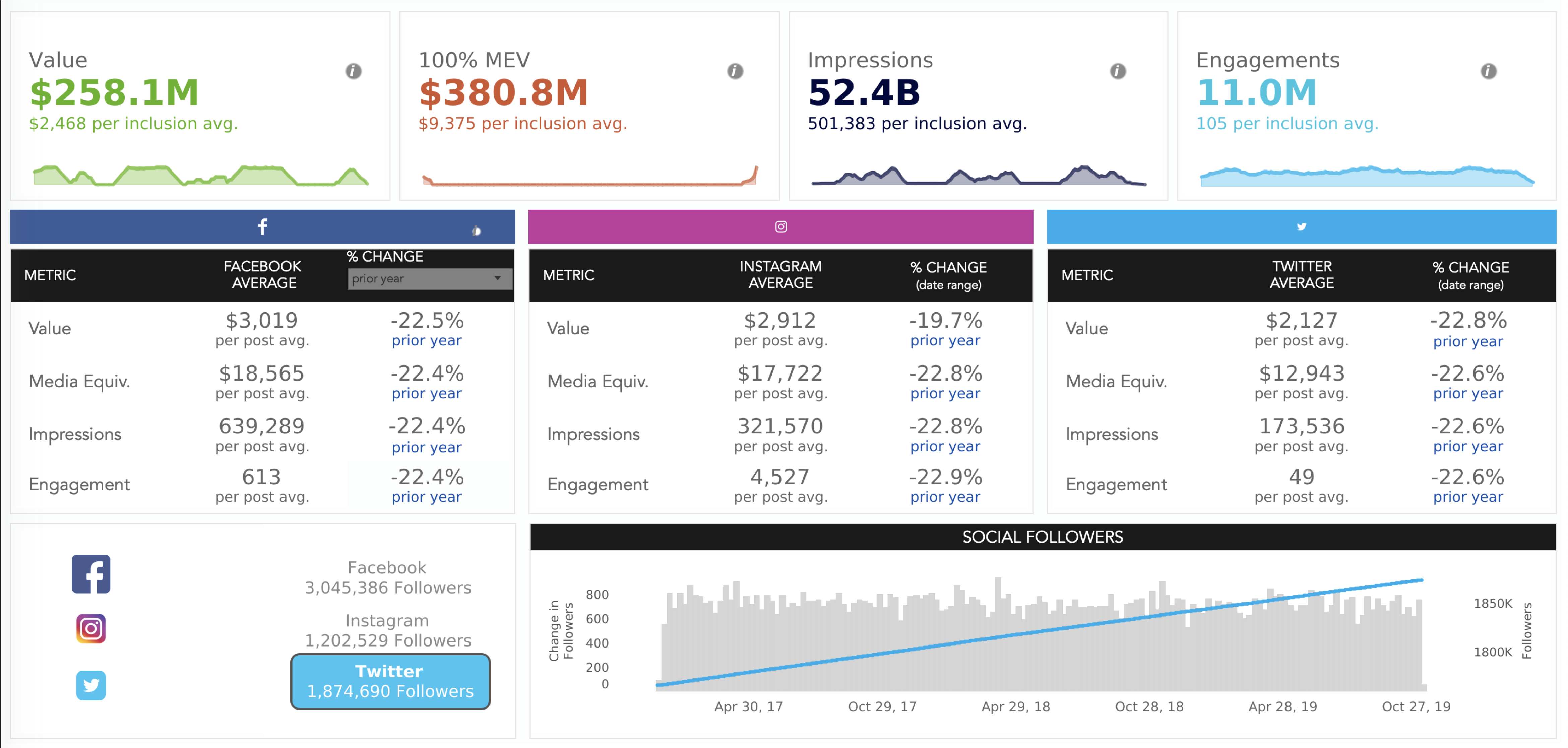
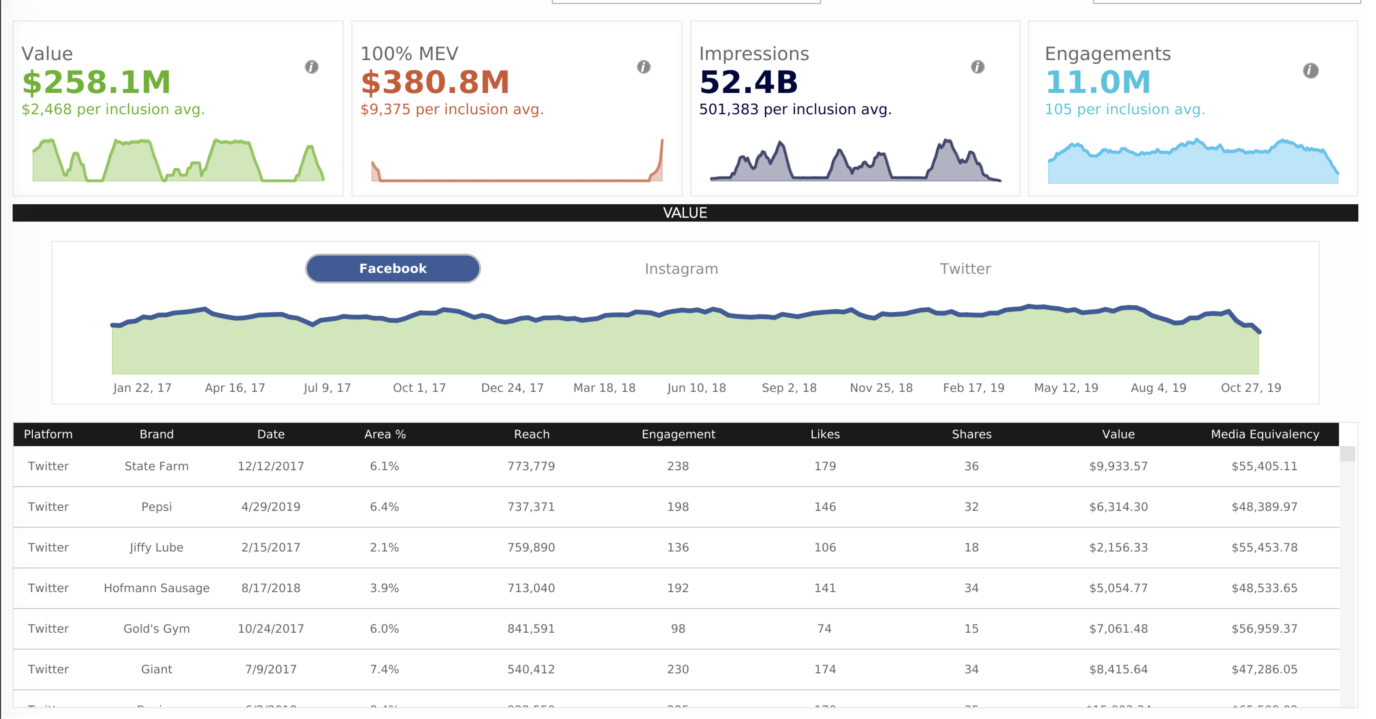
New Design - Social Media Dashboard


Old Design - Single Asset Reporting


New Design - Single Asset Reporting


Old Design - Scorecards

New Design - Scorecards

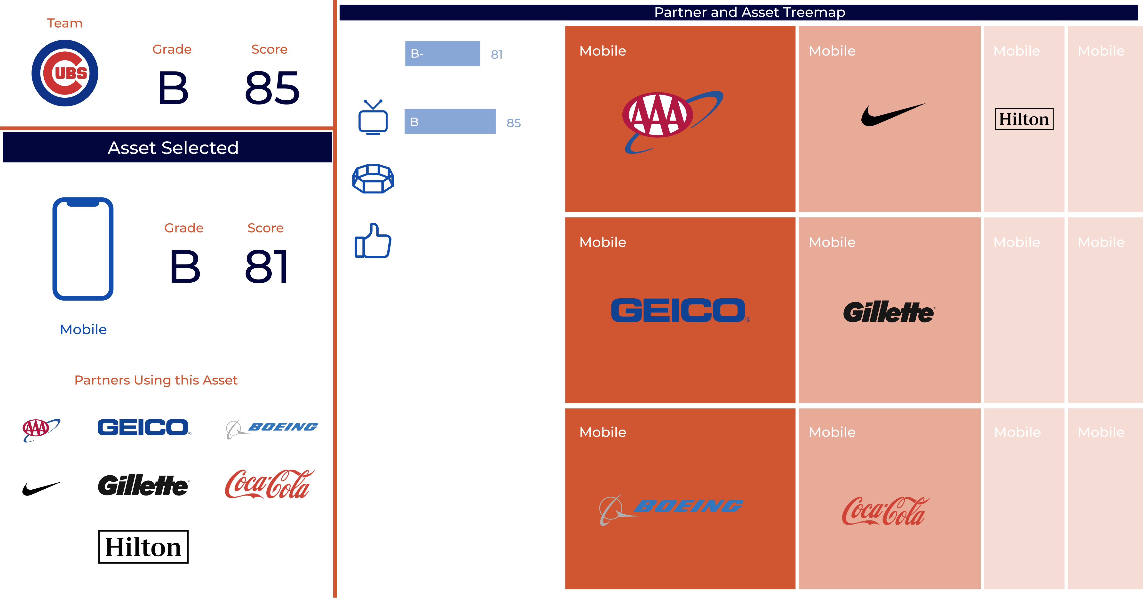
Old Design - Market Intelligence
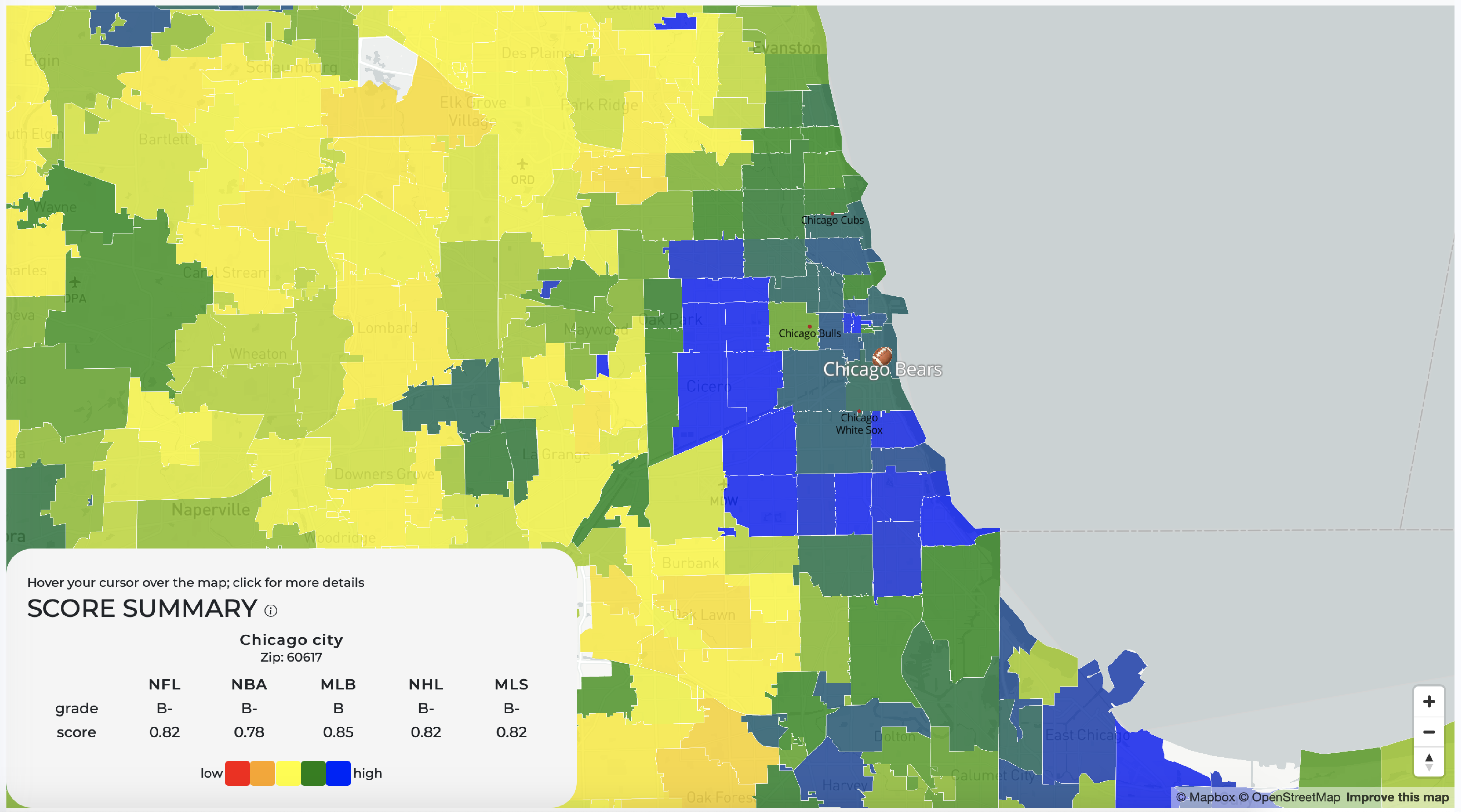

New Design - Market Intelligence

Active / Inactive Buttons Status

Inactive Option 1

Inactive Option 2

Branding Guideline


